
Guidelines for logos and sub-brands
Logo
The University of Akron logo (also known as the mark or wordmark) is the simplest representation of our visual identity, so it’s important to ensure its consistent use across media in order to build a strong, cohesive brand.
All materials from the University should bear the wordmark and comply with the standards outlined on these pages.
DOWNLOAD THE WORDMARK
For professional designers
Download the complete, compressed package. File includes all color variations in both horizontal/vertical orientations in .png and .eps formats, and are meant for use in professionally printed materials.
You will be unable to open an eps file directly unless you have Adobe Illustrator.
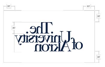
GUIDELINES FOR THE WORDMARK
- The appearance of wordmark is never modified.
- The wordmark is not to be screened.
- To avoid stretching or skewing the wordmark simply click on any four of the corner points of the window that contains the mark and drag in or out to reduce or enlarge it.
- Type is never to be printed over the wordmark.
- Fonts included in the wordmark should not be substituted, stretched, condensed, etc.
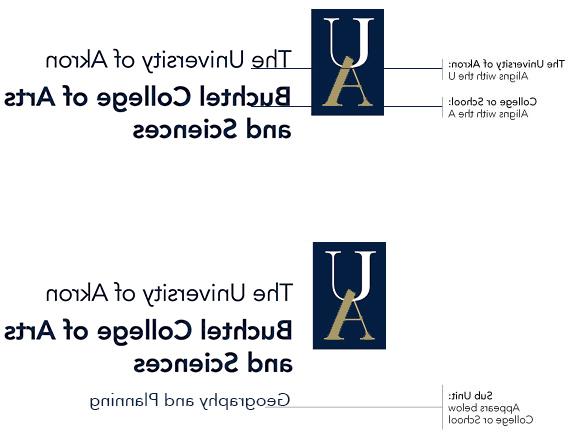
Sub-branding for colleges and departments
This section contains approved sub-branding typography for each of the University’s colleges and schools.
The sub-brands can appear in one, two, and three color versions using the university official logo colors.
To maintain the integrity of our brand, use only these sub-brands in your university communications.
No individual college of department logos should be created or used.
- Contact Matt Schafer, in UCM for assistance.
- For professional designers with Adobe Illustrator: Download the complete, compressed package of .eps files. (Adobe Illustrator required.)
Athletics branding
GoZips.com has a complete guide to our athletic branding.